


Color planning
Backsplash Ideas for Black Countertops: 5 Ways to Find Your Balance
From warm ivory to olive green and burgundy, explore five practical ways to choose a backsplash that balances black countertops, cabinets, and the rest of your kitchen.

A black countertop gives a kitchen a strong horizontal line. The backsplash can soften that line, echo it, or introduce a little color. You do not have to match black with white: cream, muted green, burgundy, and quieter patterns can all be useful starting points.
The most helpful question is not simply ‘What goes with black?’ It is ‘What else needs to stay in this room?’ Look at the cabinets, floor, handles, and appliances together before choosing the wall.
1. Use a warm light shade to soften the contrast
If bright white feels too sharp beside your countertop, try an ivory or cream direction. A light wall can give the dark work surface a clear edge without turning the whole kitchen into a black-and-white scheme.
Compare the shade with the cabinet fronts, not just the countertop. A creamy backsplash next to a very cool white door may look more yellow than expected. Subway – Warm Ivory is one place to start exploring a warmer palette. Keep a piece of your cabinet or flooring reference beside the wall when you compare colors.
2. Let a muted green connect black with wood
When a kitchen has black counters and timber shelves or flooring, a green backsplash can act as a middle note. Instead of adding another pale neutral, it introduces color while giving the wood something to relate to.
Start with one green direction rather than several: olive for an earthy look, sage for a softer contrast, or a deeper forest tone for a more enveloping wall. For a small-scale pattern, explore Mini Mosaic – Olive Green. Repeat the green once elsewhere, perhaps in a tea towel or plant pot, then leave the other accessories simple.
3. Try burgundy when you want a richer focal point
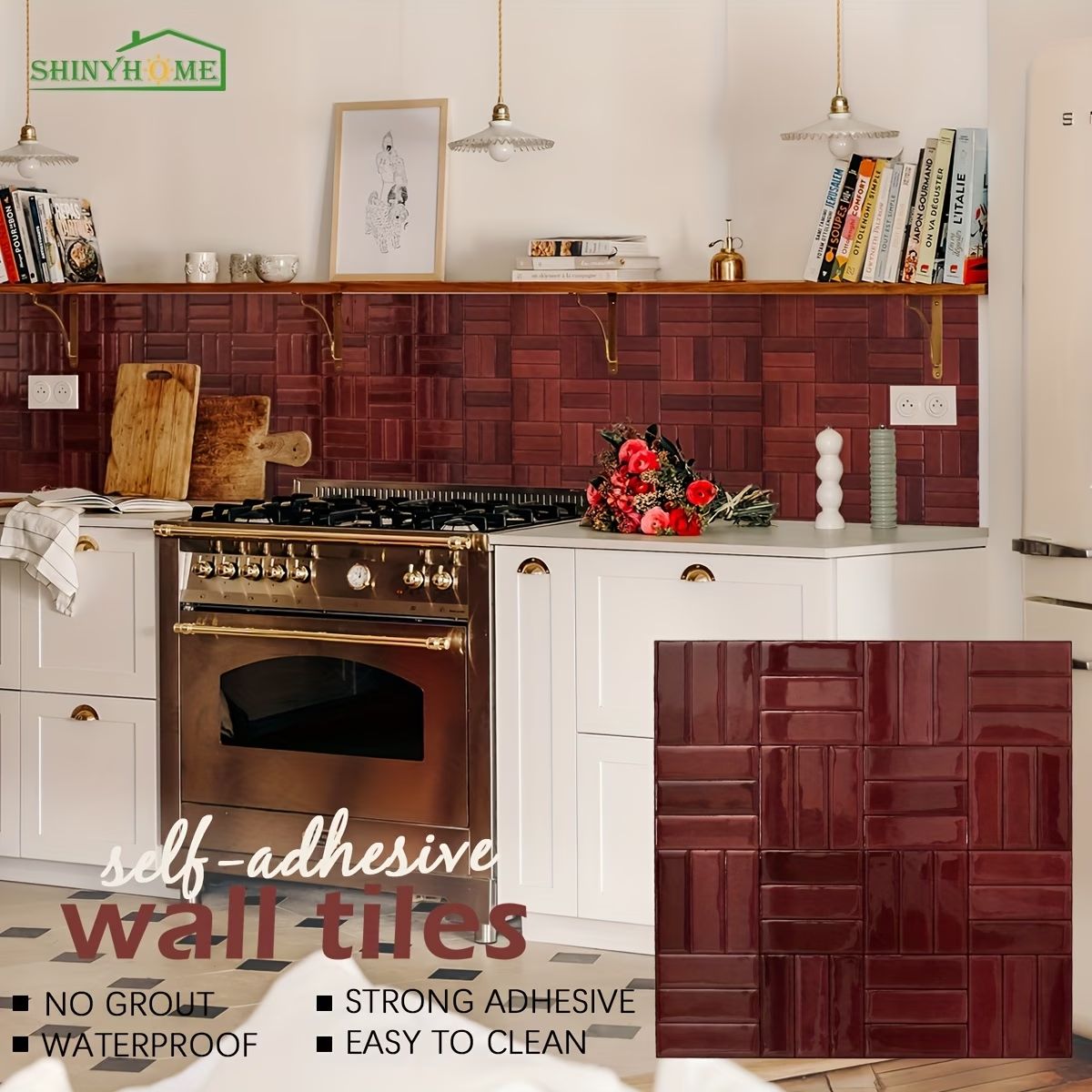
Black and burgundy can make a kitchen feel warm and intentional, particularly when cream cabinet fronts or lighter wood prevent the scheme from becoming uniformly dark. The countertop already supplies the deepest tone; the wall does not need to compete with it.
A compact backsplash area is a useful place to try this approach. Consider Mini Mosaic – Burgundy Wine as a color reference, and keep the surrounding countertop reasonably clear. Several unrelated accent colors can weaken the effect.
4. Match the amount of pattern to the countertop
Look closely at the black surface. Is it nearly solid, finely speckled, or strongly veined? A busy countertop and a high-contrast backsplash can pull attention in two directions. If your counter has pronounced movement, a quieter wall is an easier starting point.
A nearly solid black countertop gives you more room to explore a regular grid or checker pattern. You do not have to remove every other pattern from the room, but decide which one should be noticed first. View your choices from the doorway as well as from arm’s length.
5. Plan the edges before you commit
A good color choice can still feel unfinished if the backsplash stops at an awkward point. Sketch where it will begin and end: beneath the cabinets, beside a tall unit, at a window, or along an exposed return. Include sockets and changes in wall height.
Measure each wall section and check the actual product dimensions. A ten-sheet pack is a quantity, not a standard area shared by every style. Our guide to calculating tile quantities can help you turn the plan into a shopping list.
A simple way to narrow it down
Choose one light option and one colored option, then judge both against the fixed materials in your kitchen. Check product-specific surface, heat, and installation guidance before ordering. The right backsplash should work with the room you already have, not require every other part of it to change.
A little more inspiration
Basketweave
Basketweave Peel-and-Stick Backsplash: 4 Kitchen Color Ideas
Compare burgundy, olive, beige and forest green basketweave wall tiles. Find a kitchen pairing you love, then plan your layout and single-sheet trial.
Read the guide
Design ideas
Your Backsplash, in a Different Light: A Kitchen Color Guide
Daylight, under-cabinet lamps, and glossy finishes can change the feel of a backsplash. Plan a color scheme that works in your kitchen from breakfast to evening.
Read the guide
Buying guides
A Peel-and-Stick Tile Sample Checklist: Before You Buy Packs
Let one sheet answer the useful questions. Check colour in your own light, plan the pattern and separate a visual check from an adhesive test.
Read the guide