


Design ideas
Backsplash Ideas for Wood Cabinets: 5 Ways to Find Your Match
Keep the warmth of your wood cabinets. Find a backsplash that works with their grain, the countertop and the light in your room.

The most useful backsplash ideas for wood cabinets start with the wood and the countertop, not a trend photo. Pale oak, honey-toned timber and deep brown cabinets each bring a different balance of colour and grain. Choose whether the new wall should soften that balance, add contrast or become the room's focal point.
A simple starting point: compare three things together—cabinet, countertop and one tile sheet. A colour that works beside wood can still clash with the worktop between them.
1. Read the wood in your own kitchen
Look at a cabinet door in daylight and under the lights you normally cook with. Is its overall colour pale and muted, golden, reddish or deep brown? Notice the grain too. Strong grain already contributes pattern, even when the cabinets seem neutral.
You do not need a technical label for the timber. Write a short description such as “golden wood, dark handles, quiet cream counter.” This becomes a useful shopping brief. If the finish looks different in the evening, keep both versions in mind when comparing tile samples.
2. Pair pale wood with a clear, quiet backdrop
A pale backsplash can let light wood and a few well-chosen objects take the lead. Subway – White is one crisp option to compare. Check it against the countertop rather than assuming all whites match: a cool white beside a creamy surface may create more contrast than you intended.
Keep the grout-effect lines in the comparison. Strong lines can make a simple shape look quite graphic; lower contrast can feel calmer. Judge the whole sheet from across the room, not just one white tile in a close-up photograph.
3. Try a muted green beside warmer wood
Soft green can introduce colour without adding another timber tone. Compare Checker Tile – Sage Green for a repeated square pattern, or Picket Tile – Watercolor Sage Green for an elongated shape. Their patterns are different, so choose the rhythm as well as the shade.
Try this small styling exercise: remove the patterned tea towel, mat and countertop containers from your sample photo. If the green looks more settled, the issue may be competing accessories rather than the tile. Bring back one colour or texture at a time.
4. Use a richer wall when you want contrast
A burgundy or red-brown tile is an option when you want the backsplash to be a feature. Classic Square – Burgundy Chocolate offers that deeper colour direction. With darker cabinets, compare how much separation remains between the wall, countertop and cabinet faces.
If the room feels too visually heavy in your test, narrow the feature to a defined coffee corner or compare a paler option. Dark tile is not automatically wrong in a small space, but it needs to be a choice you enjoy in the actual lighting—not just in a bright product photo.
5. Let a busy countertop set the pattern budget
If the counter has pronounced veining or speckling, start with one relatively simple tile repeat. If the counter is quiet, you have more room to explore a checkerboard or mini mosaic. This is a way to organise the decision, not a ban on mixing patterns.
Photograph your sample next to an entire cabinet door and a useful stretch of counter. Crop out unrelated parts of the room, but keep enough context to see the proportions. For white cabinets elsewhere in the same kitchen, our white-cabinet backsplash guide can help you compare the two zones.
Before you order
- Check the sheet upright in daylight and evening light.
- Compare the tile's pattern lines with the wood grain and countertop.
- Plan a clear finish at cabinet edges, windows and inside corners.
- Confirm the wall's suitability and the product's usable sheet coverage.
- Keep a photo of the final combination, with the product name noted.
Quick questions
Should the backsplash match the wood cabinets?
It does not need to match. Decide whether you want a calm supporting colour or deliberate contrast, then check that it also works with the countertop and lighting.
Can I mix a tile pattern with strong wood grain?
You can, but compare the complete repeats together. If both demand attention, reduce contrast in one element or simplify nearby accessories before committing.
Keep the cabinets. Rethink the backdrop.
Explore ShinyHome wall tiles and shortlist two contrasting directions. Read the buying guide to turn the styling choice into a workable wall plan.
A little more inspiration

Christmas Kitchen Decor
Christmas Kitchen Backsplash Ideas: 3 Cozy Color Pairings
Bring Christmas warmth to your kitchen with burgundy, ivory cream, and olive green backsplash pairings, simple festive accents, and looks to enjoy beyond the holidays.
Read the guide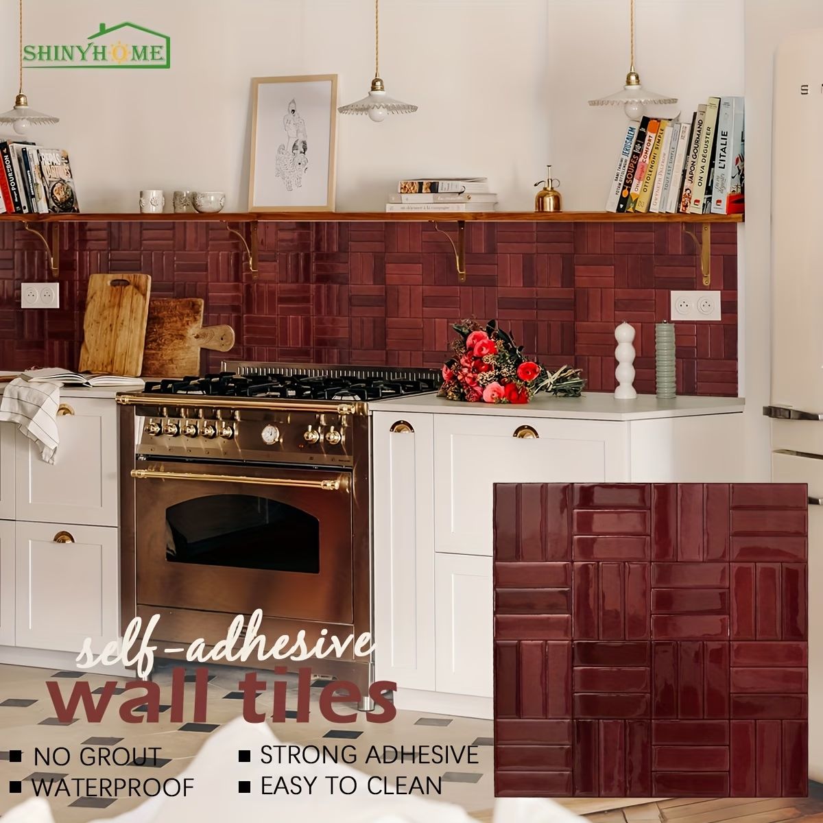
Basketweave
Basketweave Peel-and-Stick Backsplash: 4 Kitchen Color Ideas
Compare burgundy, olive, beige and forest green basketweave wall tiles. Find a kitchen pairing you love, then plan your layout and single-sheet trial.
Read the guide
Color planning
Backsplash Ideas for Black Countertops: 5 Ways to Find Your Balance
From warm ivory to olive green and burgundy, explore five practical ways to choose a backsplash that balances black countertops, cabinets, and the rest of your kitchen.
Read the guide